View Your Scan in 3D and on the Map
Once your survey is uploaded to PolarWave Data, you can explore it as a fully interactive 3D model, a 2D colour map, or overlaid on a live satellite map. This page covers how to interact with each view.
Not uploaded yet? Start with Visualise Your Survey Data first.
The 3D Model
The main viewer opens in 3D view by default — a three-dimensional surface render of the magnetic data.
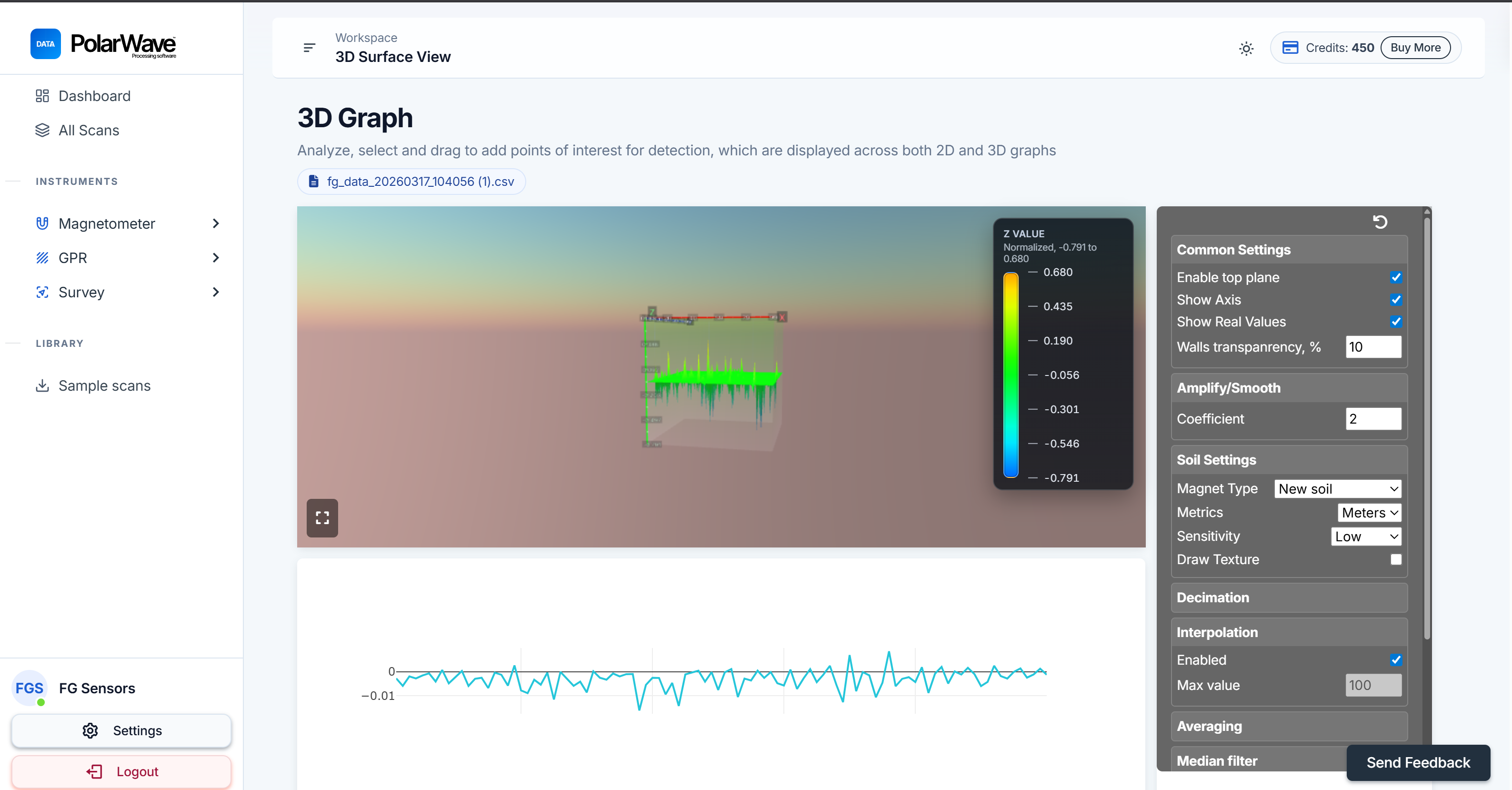
Interacting with the Model
| Action | How |
|---|---|
| Rotate | Click and drag to spin the model and examine it from any angle |
| Zoom | Scroll up and down to zoom in and out |
| Pan | Right-click and drag (or two fingers on a trackpad) to pan across the surface |
| Tags | Click on the 1D or 3D graph to place tags on points of interest |
Switching Between View Modes
Use the Magnetometer section in the left sidebar to switch between views at any time:
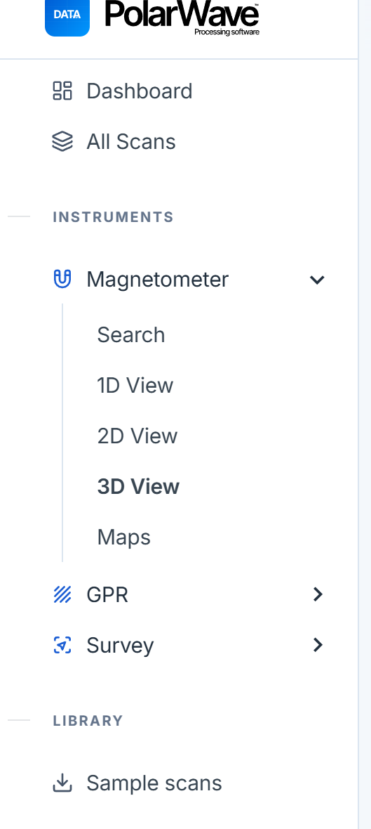
| View | Best for |
|---|---|
| 1D | Line graph of the raw magnetic signal — identifying individual anomalies along a survey line |
| 2D | Flat, top-down colour map — getting a clear spatial picture of where anomalies are located |
| 3D | Interactive three-dimensional surface render — understanding the depth and shape of anomalies |
| Maps | Scan overlaid on a satellite or street map using GPS coordinates |
The Map View
Switch to Map View
- Click Maps in the left sidebar under the Magnetometer section.
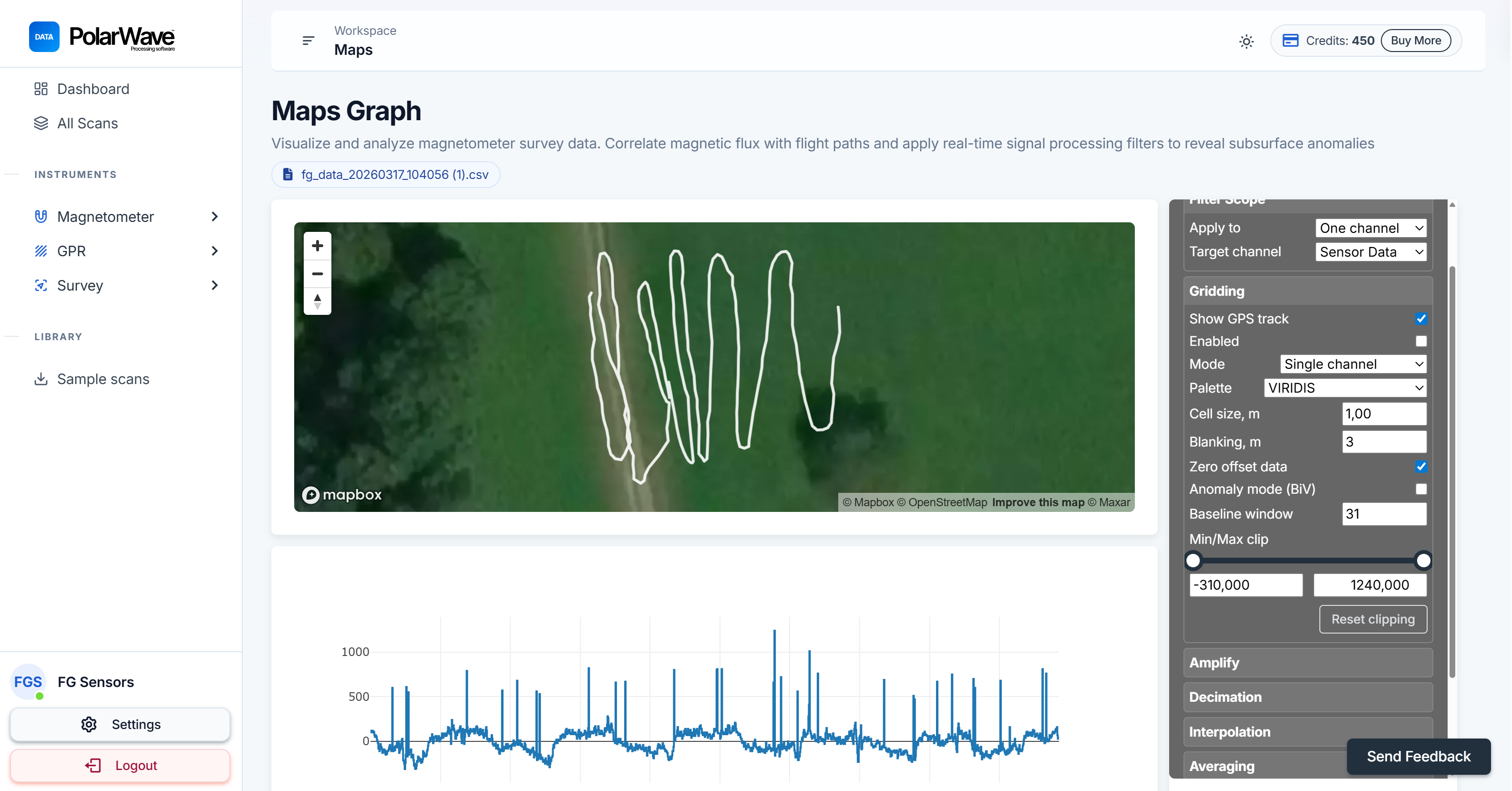
- The map will initially display only a GPS track line showing the path you walked during the survey. This is normal — gridding has not yet been applied.
The GPS line confirms that your location data was recorded correctly and that PolarWave Data knows where in the world to place your scan.
Enable Gridding
Gridding interpolates your survey data across the area you covered, turning the raw GPS track into a filled colour map:
- Look at the right-hand panel in the Map view.
- Find the Gridding toggle and switch it on.
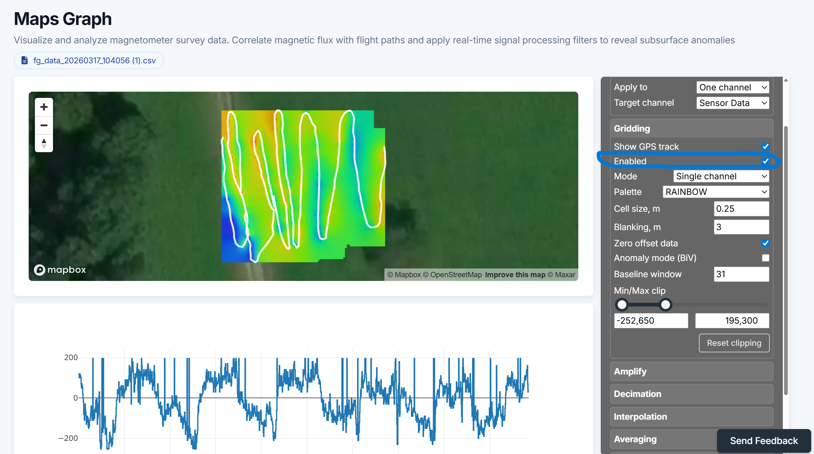
- The map will update within a few seconds, displaying your scan as a colour-coded grid overlaid on the map background.
If your gridded map looks patchy or has large blank areas, it usually means survey lines were spaced too far apart. Tighter line spacing during the survey gives a smoother, more complete grid.
Continue to Analyse and Map Your Scan to fine-tune filters and gridding settings.